When it first came out, iOS was truly a revolutionary operating system. In recent years, though, it hasn't really changed much, with iOS 6 more of a tweak. Finally, with iOS 7, announced with the iPhone 5S , we've got something newer and altogether more modern. Since we wrote this review, Apple has further tweaked and updated the OS, with iOS 7.1. We've updated this review to reflect this upgrade, as it's one that all iOS 7 users should make.
One of the key things about the point release, is that iOS 7.1 is more stable than the previous version of the OS. In particular it stops the UI crashing, where your phone locks up, shows the white boot screen and restarts the user interface, leaving your applications untouched. It also improves TouchID and makes a few needed interface tweaks, which we'll mention where relevant.
As with previous updates, iOS 7.1 is available as a free upgrade for phones upwards from the iPhone 4, and iPads upwards from the iPad 2. Of course, performance and available features differs by device (see Restrictions later on for the full information).
iOS 7.1 USER INTERFACE
At a first glance, iOS 7.1 isn't that much of a departure from previous versions of the mobile operating system. The home screens are still made up of small square icons that you tap to launch an app. Aside from the calendar app now showing the current date and the clock showing the current time, these icons are static, bar the ability to show an unread notification count. For example, the Mail icon will show you how many unread messages you have in your email accounts.
There are no Android-style widgets on display, which is a shame in some ways, but we kind of understand why not. People are familiar with iOS, so making too many changes, particularly to the main interface is bound to cause some confusion. What we get instead are changes to the look and feel, with the bulk of the updates sitting below the surface.
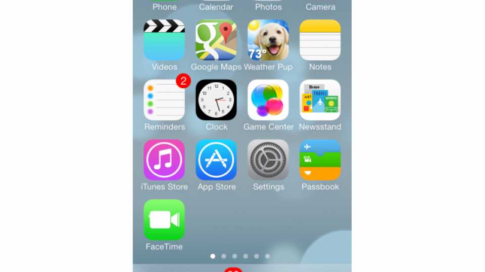
While we'll get on to these changes soon, the change to the look is rather radical. Now the design is flatter, with the complicated icons of old gone and replaced by cleaner, simpler designs. This theme is replicated throughout Apple's apps, giving the OS a much more modern and cleaner feel.
It's clever, too, with the colours of folders changing to match the predominant shade of your background picture. It's a togetherness and blending that helps make the OS feel that bit more cohesive. With iOS 7.1 Apple has further tweaked the interface to give it a more uniform look. Most noticeable are the Slide to power off screen, which now puts the slider in a lozenge, rather than a square. The phone app now has round Call and Hang-up buttons, plus a lozenge Slide to answer bar. OK, so it's not a massive change, but it's nice to have the consistency and this style better matches the other interface changes.
While the look's the thing that's most noticeable, it's the changes under the surface that really iOS different and, in our opinion, much better.
iOS 7.1 CONTROL CENTRE
One of our biggest bugbears with iOS was that you had to go in Settings to make even the simplest change. For example, you couldn't turn off Wi-Fi or go into Airplane mode without delving through Settings. While these options are still in there, the new Control Centre gives you straight up access to common features, all through a menu that you swipe up from the bottom of the screen. The best thing is that Control Centre is available from any screen or app, although you can disable it on apps if you prefer.
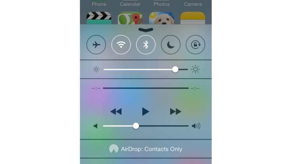
The menu lets you adjust screen brightness, toggle Airplane mode, Wi-Fi, Bluetooth, Do Not Disturb and the rotation lock. It also lets you control playback of the current media, plus it has shortcut icons for common utilities: flashlight, stopwatch, calculator (not on the iPad, as this doesn't have a calculator app) and the camera. It's truly a brilliant addition to the operating system and has saved us a ton of time already.
The implementation is neat, too. On the homescreen a simple swipe up brings up Control Centre; on an app, a swipe brings up a small tab that you have to tap and drag up to open the menu. This means that if you're playing a game, for example, a wrong press won't bring up the menu and distract you.
iOS 7.1 NOTIFICATION CENTRE
Notification Centre, the pull down menu from the top of the screen, was introduced with iOS 6, but it's been updated for iOS 7. First is the new Today tab, which shows you your upcoming appointments for the day, with calendar snippet showing you your next meetings.
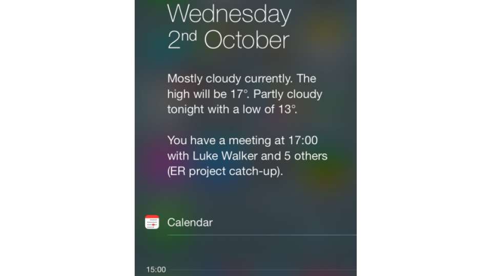
There's also an All tab to view all notifications, such as which apps were updated and new Twitter followers. Then, there's the Missed tab, which lets you see notifications for events you've missed, such as a missed call or a new voicemail message. Just tap any notification to be taken to the originating app, so you can deal with it or get more information.

You can use the Notification Centre app in Settings to choose which notifications you're shown and how they appear, so you can mute an app if you find it too verbose. Again, this update means you've got access to more information at your fingertips, without having to hunt through a load of menus.


