The BlackBerry Priv is a real beast of a smartphone. It's huge, heavy, and is packed with so many extra features that BlackBerry quite literally couldn't fit them all on, instead choosing to hide its infamous physical keyboard underneath the main display. Push up from the bottom of the phone and the screen slides upwards, revealing a full QWERTY keyboard that also doubles up as a touch-sensitive track pad for scrolling and fine cursor control.
It's an elegant solution to something BlackBerry seems to have been struggling with for years, as it's never quite reconciled how to combine its trademark keyboard with a large main display. It had a pretty good go with the super wide BlackBerry Passport earlier in the year, but that was so unwieldy that you could barely hold it in one hand. The Priv, on the other hand, is a far neater blend of both technologies and is arguably better than anything BlackBerry has done before.
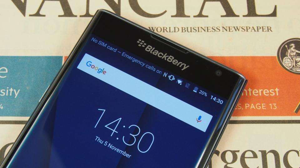
It might all be too little, too late, though, as BlackBerry's decision to jump ship to Android Lollipop as opposed to labouring on with its own BlackBerry OS means there's now very little to distinguish the Priv from the rest of Android's top flagships. It still comes with some dedicated BlackBerry apps, such as BlackBerry Hub, which is a one-stop shop for all your various communication and social media channels, and DTEK, BlackBerry's privacy dashboard, but otherwise it's a much more level playing field - for more on Blackberry's Android plans read Know Your Mobile .
Display
That hasn't stopped BlackBerry from going all out with the Priv, though, as it still has everything it needs to compete with today's top-end competition. The best example of this is the 5.4in curved AMOLED display, which slopes round the side of the phone to the rubbery soft touch rear to create a near-seamless circular edge, much like Samsung's Galaxy S6 Edge and S6 Edge+ .
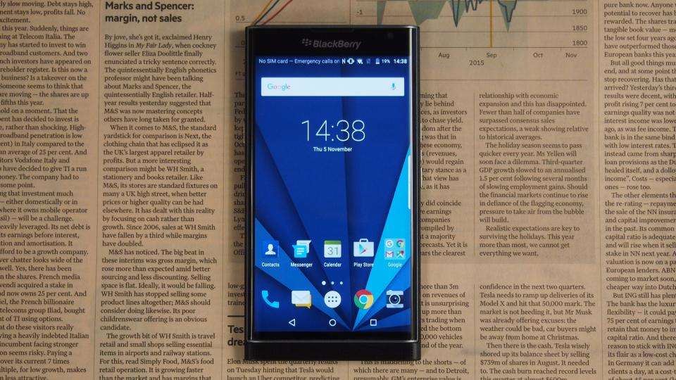
With a 2,560x,1440 resolution, the Priv's 540ppi pixel density is actually higher than the S6 Edge+, giving everything a razor-sharp finish to help it look smart and professional. Colour accuracy is also superb, as its AMOLED panel covers the full 100% of the sRGB colour gamut, delivering bright, punchy colours that really jump off the screen. With a perfect 0.00cd/m2 black level, text really stands out against light backgrounds, and a contrast ratio of 41,987:1 captures every shade of shadow detail in between. The Priv's max screen brightness only extends to 344.46cd/m2, but this is pretty typical of AMOLED displays and is still just about enough to use outside without any great difficulty.
BlackBerry's also managed to make much better use of the curved screen than Samsung's S6 Edge and S6 Edge+, as its Productivity tab menu is full of quick access shortcuts that make it a far more practical addition to the phone than Samsung's Edge screen. Swiping the translucent tab on the curve, presents a quick overview of your unread emails, calendar appointments, tasks, any missed calls and favourite contacts. It can also be configured to appear on both the right and left hand side of the screen, with varying degrees of thickness and at any height, making it much easier to use than Samsung's quick contact menu.
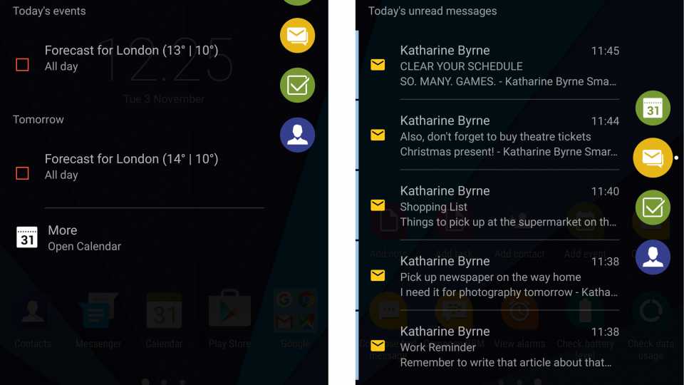
^ BlackBerry's Productivity tab is a lot more useful than Samsung's Edge screen, as you can look at your calendar, contacts, tasks, emails and open each individual app with a simple swipe and tap
During everyday use, though, the curve can be a bit distracting, as it's very prone to reflections and catching the light. This can make reading web pages a little tricky, as the edge of the page doesn’t extend all the way round the curve. Instead, it just stops short of the curve, making it a prime target for overhead light reflections.
Keyboard
The screen needs a pretty firm push to slide up and down, but at least the metal rim round the edge provides a firm starting point if your thumb isn't already on the screen. The keyboard itself feels very cramped, and it's not particularly easy to type on if you have long nails. Some of the keys feel looser than others, and while they are larger and wider than previous BlackBerry handset keyboards, I still struggled to type more than a few sentences without making typos. I was never a BlackBerry user, admittedly, so anyone who has resisted making the switch to a touchscreen-only device might find themselves right at home. The raised keys feel surprisingly tactile and the phone is balanced to make it comfy to type on, without feeling top-heavy. It's also backlit, making it easier to type in the dark.
The main benefit is that using the physical keyboard leaves you with a lot more screen real estate. The lack of an onscreen keyboard lets you see much more of your message thread or word document while still being able to type and edit. The Priv still has an onscreen keyboard, of course, for when the physical keyboard is hidden away, but it's nice to have the option. The physical keyboard also doubles up as a touchpad for scrolling down web pages, but the keys can make it feel slightly less responsive than using your own thumb.
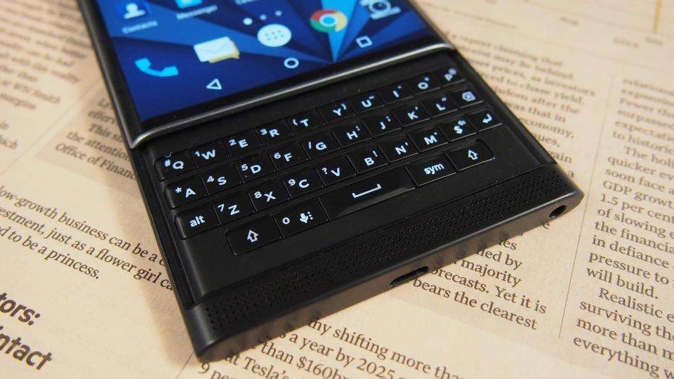
Another handy keyboard feature is the ability to assign shortcuts to every single key, whether it's to open an app, speed dial a particular contact or send a message to someone. To assign a shortcut, simply hold down the key in question and pick your shortcut, so you could have C for Camera, or T for Twitter, for example. Then, all you need to do is long-press that particular key and the shortcut will activate in little more than a second, making it much easier to jump between apps without returning to the home screen.
Ironically, though, it's BlackBerry's virtual onscreen keyboard that really makes typing quicker and easier, as its smart word suggestion software actually suggests words based on the letter you'll type next, allowing you to swipe upwards on the screen to automatically paste it in. It learns as you type, too, so it's more likely to suggest other words next which fit your intended sentence, allowing you to rattle off sentences much faster than typing them out manually. The physical keyboard still offers this to some extent, but you're only limited to three words (which can be added by swiping up on the left, right and centre of the keyboard), as opposed to four or five.
In my eyes, this rather negates having the physical keyboard in the first place, and I found I very rarely used it during every day use. After all, when onscreen keyboards are so good these days, the need for a physical keyboard seems rather unnecessary, especially when the onscreen keys are bigger and easier to press than their physical counterparts. Admittedly, the shortcuts have a lot of potential, particularly if you like to keep your home screen nice and tidy, but otherwise it's not a particularly huge draw for me.


